Afton: Hell Raising & Heaven Storming
This collection examines William Blake's interpretations of Dante's Inferno through a queer lens, exploring how Blake's dissent from Dante's core theological premises parallels the complex relationship between queer individuals and religious iconography. By analyzing Blake's artistic and philosophical divergences from Dante, this work seeks to illuminate the evolving understanding of morality, desire, and divine justice, while reflecting on the queer experience of simultaneously yearning for and challenging religious traditions.
AFTON'S PERSPECTIVE
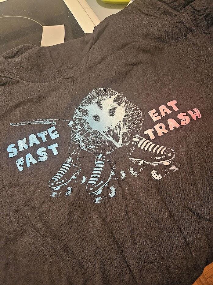
You don’t have to be religious in any way to be familiar with the idea of hell. I am someone who has fully deconstructed my faith that I grew up with, and am still working through some of the trauma that accompanies that experience. As much as I don’t believe that hell is an actual place, I do believe that we each have our own personal hell, just like how we all love and hate different aspects of skating. I was joking with Alex about making this idea a shirt, and they started running with it.
I chose Dante’s inferno and the idea of seven layers of hell, because I truly believe there are different levels of skating. I’m not just talking about how good you are, but also styles of preferred skating as well. Some people want to skate alone, some only like to skate in groups. Some wanna just play around on flat ground, while others want to compete at every possible competition available. As we grow in our own unique styles we find our real “identity” and what works for us inside this community. The deeper we go the more infectious this sport becomes, and the more we push our bodies. All the same skating isn’t really known for its overly zealous religious undertones either. I’m not saying there aren’t religious skaters, but more times than less people think of punk/alternative lifestyles.
These ideas are what I tried to encompass in this design, while using a little bit of humor. No matter what skating looks like to you, we all have our levels of love and hate for varying aspects of what we do. I also am not anti religion, until someone starts pushing that lifestyle or judging my own lifestyle based upon a belief system I don’t hold. Some of what’s going on in life right now is a political game, and some are people that truly believe trans/gay/etc people should be completely out of sight out of mind. Life is too short for hate like that, so if there is an eternity I have absolutely no desire to live forever with people or a god like that.
ALEX'S PERSPECTIVE
Afton, a dynamic force in both park skating and derby (and member of the gndr shredr skate team), came up with the idea for the "Seven Layers of Hell" piece. One afternoon when I had just started reading Dante’s Inferno, Afton sent me a picture of an illustrated map of hell, and wanted to write “some of y'all need to go to church cause I don't want you in hell with me” styled as if spray-painted on the walls of the inferno. Obviously, having just picked up a copy of Dante's Inferno from a library sale and reading a few cantos, there wasn't a question of if I should make that, but how. Afton gave me permission to run with the idea stylistically.
While this collection was taking shape, I reflected on reclamation. Reclaiming identity, giving new life to discarded materials, reclaiming spaces and scenarios that once were not safe. And most importantly, reclaiming spiritual symbols, stories and aesthetics that are tied to a religion I left behind, but which still colors my perceptions and experiences. In the past, I've focused on the aspect of taking up space as a reformative act, but instead my pre-reflective consciousness connected with Dante's vivid religious imagery and the collection became an intrinsic part of that experience. Taking back, using, and transforming symbols, methods and aesthetics of an unsafe entity *can* be healing. My experience growing up in the Catholic church - as a queer, childhood abuse survivor - was not always good, for self-explanatory reasons; yet also provided some safe and transformative experiences.
*Some symbols are so associated with certain movements as to be contextually inseparable, and would be irresponsible to reproduce.*
But whether the messages we hear and their effects are positive or negative depends on that community. What good is a community that up front claims to value all life, and doesn’t in practice? What harm does a community do that teaches its followers prejudice and calls it love? How is it not obvious that church leaders and authority figures are appropriating their own holy texts to skew the meaning for their gain? How can we apply our own points of view to old symbols to transform their meaning for the good of the queer community?
DESIGN PROCESS
Being a pupil of the school of play, I try to find, take a hold of, and break the line between design and art. A tool that a lot of artists + designers employ to achieve this goal is appropriation- that is, taking something well known, and recreating, adding, subtracting, substituting, and generally transforming that thing into something with entirely new meaning and clearly reflects your personal style. Studies are similar, but employed with a different purpose, to understand a technique, hone your skills, and as a form of respect and admiration to the reference artist. In preparation for this piece, I looked at lots of different artists' interpretations of Dante's Hell, but ultimately felt myself most drawn towards the original map Afton sent, a lithograph by Jan van der Straet.

This image was my reference. As my experiences and artistic inspirations change, I incorporate new and different mediums into my process as much as possible. Mediums channel emotions differently; this is something I think every artist reveals as their bodies of work grow. My favorite creatives are people who work in many spaces, make work where, when and how the inspiration dictates. This is what I try to hold on to in my creative process.
Having Jan van der Straet's reference, I pondered over how this was going to turn into a new piece of art. Usually I start by just sketching, seeing how shapes interact, finding proportions, defining areas of shadow. For previous collections, I've taken a much stricter digital approach, starting sketches in Procreate, and either doing the whole process there, or finishing in Photoshop or Illustrator, depending on how the piece is shaping up detail-wise. This year, as I was pondering the heat and depth of hell in the sunless, cloud covered Oregon winter, I felt drawn towards my sketchbook. This is a pattern I've started observing over the past three years in Oregon; when the world feels still, and the rain has been shivering it's way into our bones for months, all I want is to connect again with the earth; and in the absence of warmth, light, cut grass to smell and millions of leaves to observe and bury my essence in, I achieve this with the feeling on pencil on rough paper.
My goal was to replicate the piece, using it as a reference, with pen + ink. After sketching, I used my favorite inking implements, the Pentel 2mm sign pen, Fude brush pen in extra fine, .05 lining pen, and my calligraphy pen with both black and white inks. My process was largely feeling based, and I let my observations of the piece dictate which areas needed more ink vs. white space. After laying down the lines and 100% black shadows, I added some large marks with the brush pen saturated with ink to create drips, more texture in the rock face, and splatters. Then, I incorporated some of my grey toned comic inking pens to create softer shadows and build on the tones. White ink with the sharp calligraphy pen and the .05 black liner were used to build in more tones and details. Here's a look at the finished ink piece, and inked letters:


Once I was happy with the inked piece, I wanted to further transform it and reclaim this historical, religious piece for modern, queer times. Being a multi-disciplinary artist, this came organically through blending traditional and digital techniques. I scanned the ink drawing and took it into Photoshop, to introduce and play around with color. Again, this process is largely experimental, though by no means non-purposeful. Afton was a huge help in the color experimentation, giving her thoughts and opinions freely and kindly. Eventually we settled on this grungy, neon green, purple and yellow colorway that fit Afton's vision, and strengthens the contrast between modern and historical, turning artifacts into pop art. Here's a version we didn't use, and the final:


I think Afton's layer of punk defiance plays perfectly with the reinterpretation of religious iconography. It's a bold statement piece that challenges viewers to reconsider their notions of morality and community. We hope y'all enjoy the piece, and you can read more expanded thoughts on the collection here.