Brendan: Staying Soft in a Hard World
This collection examines William Blake's interpretations of Dante's Inferno through a queer lens, exploring how Blake's dissent from Dante's core theological premises parallels the complex relationship between queer individuals and religious iconography. By analyzing Blake's artistic and philosophical divergences from Dante, this work seeks to illuminate the evolving understanding of morality, desire, and divine justice, while reflecting on the queer experience of simultaneously yearning for and challenging religious traditions.
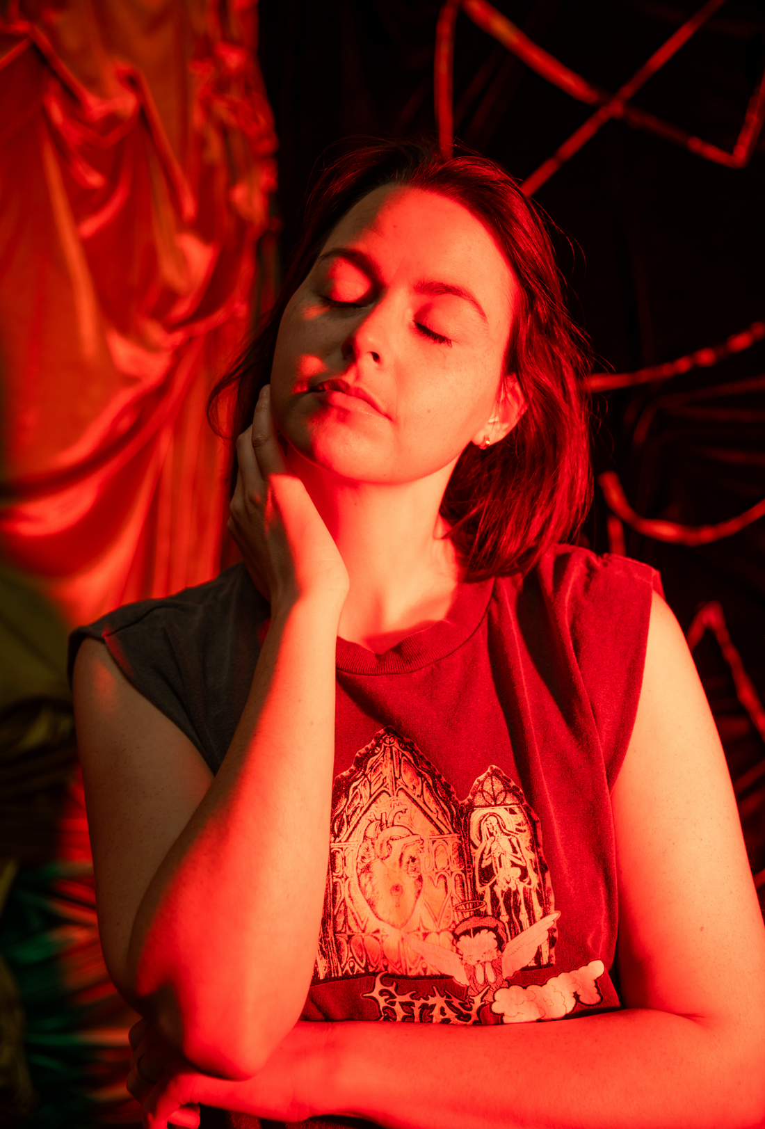
Brendan Hanna, of Boys Do Cry, was paramount to bringing the "Stay Soft" design to life. Inspired by the Mitski lyric “open up your heart like the gates of hell,” this piece speaks to the vulnerability and resilience at the heart of the queer experience.
Brendan's Perspective
In their words:
It's hard to say what my process is because it changes from design to design, with some of my earlier shirts being really photo heavy and more recent stuff being really illustration heavy. But basically most of the concepts are taking some kind of bootleg imagery and mashing them together. Generally I'm drawing inspiration from music subverting gender expectations—whether that's Lil Kim rapping that she's "hard as a cock" or Morrissey effeminately saying something beautiful and whiny. For this collab, we were going off of the Mitski song "Stay Soft" which is basically about getting your heart ripped to shreds but staying soft anyway instead of becoming callous. And for me, as a man who was raised by the world to stuff my feelings and build up armor to stay safe from the world, to stay soft inside even though that's the most challenging thing to do.
Alex's Perspective
Brendan's character and text design, rubber hose comic inspired and minimal, creates an intentional tension (an in-tension) with the detailed ink drawings. To me, it's a visual representation of the contrast between societal expectations of emotional restraint and the overflowing emotion that inevitably spills its way out of us.
This collaboration embodies emotional openness, challenging gender norms and celebrating the strength found in softness. It's a powerful reminder that in a world that often demands we harden ourselves, there's revolutionary power in choosing to stay soft, allowing emotions to permeate our being and keeping our souls malleable to the lessons that we learn.
Design Process
Brendan and I both do quite a bit of collage work, and have similar tastes for texture, harsh shadows and grunge. We decided to both contribute some design elements and do our own versions of the design by collageing them differently. We decided that Brendan would draw the characters and text for the scene, and I'd do the background.
Inspired by the lyric "Open up your heart like the gates of Hell," I clearly knew I wanted to imagine my version of the gates. Unlike the map of the layers, I wasn't working off of a direct reference; instead, most of my research was focused on wrought iron gates in the baroque and gothic styles.
Early on in my sketches, I wanted to incorporate a triptych design. Triptychs are incredibly pervasive throughout art history, and some of the most influential pieces of religious art are tripdychs. Tripdychs excell at telling a story. Humans love to create in threes; not only is it a divine number, but stories need a beginning, middle, and end. They need a protagonist, supporting characters, and an antagonist. Art necessitates a theme, a voice, and a method. Tripdychs give us the physical and metaphorical space to thematically connect technically separate works of art; a static series utilizing the physical space between them to denote meaning. When you add more panels, and a less time consuming medium, you create a comic.

the Annunciation (Merode Altarpiece), Workshop of Robert Campin, Netherlandish, ca. 1427-32

the Crucifixion, Rogier van der Weyden, Netherlandish, ca. 1460
These examples, both of which come from the early Netherlandish period in the 13th century, display a breathtaking amount of detail that convey highly sophisticated natural metaphors and brings a lifelike and humanistic presence to mythic stories [if you're interested in more in-depth analyses of these pieces you can find so here + here].
Back to the design process...
As I was drawing, the small voice of the church that still lives in the back of my head, as much as I tried to let it go, was whispering anxieties of it being too much, too blasphemous; offensive to my Catholic family, branding myself a satanist. There was also another voice, the one negatively affected by the church, that distanced itself from all memories and cut ties to religion, anxious that the piece would betray my stance against the church and expose too much of my connective tissue with religion. I did plan a third subject for the rightmost panel, a depiction of Satan at the core of Hell, consuming Judas Iscariot, flanked by minor demons. As it was being inked, I felt it was swinging a little far towards violece, and I didn't want to use needlessly dark depictions to make my point. At the core, I'm fearful that people will take my work in a way that it wasn't intended; but, of course, that's a risk any artist takes.
In my tripdych, I wanted to pay homage to the Cathedral where I attended mass as a child, and the stained glass windows of ethereal figures that graced its interior. Specifically the figure of the Virgin, a staple in art history and which can be found in nearly every Cathedral. However, in my depiction, Mary is seen stripped of flesh and blood, a lone skeletal figure, who's body is on full display; this figure is mirrored on both sides of the tripdych, replacing the abandoned Satan & Judas. Are both figures Mary? Is it Mary and Veronica, or Dante's Beatrice? Even I'm not totally sure.
The second major design element, highlighted in the middle panel, flanked by the Skeletal figures, is an anatomical heart. Unlike Mary depicted in the gate, it has no body, no humanistic figure, but represents the largest muscle and vital element to the human spirit, that pumps the blood and drives our being. In philosophical circles, there is constant and unanswerable debate around the spirit and the body; personally, I ascribe to the belief that the body and the spirit are one in the same. Our emotions and consciousness are interconnected, and affect our physical form. The heart, unrealistically large in the piece, intentionally contrasts the skeletal figures, highlighting the importance of connecting to your physical spirit, staying true to your emotions, over a curated, societally acceptable projection.
Here's the sketches and finished ink drawing:


Brendan then supplied me with his contributions, the foreground figure and custom lettering. I asked them to draw whatever felt right, and he chose Betty Boop, being a fan of repurposing pop art and rubberhose illustrations in a queer and punk context. Betty became the figure of Virgil, waiting to guide Dante on his journey, or perhaps Beatrice, praying for the absolution of his soul.
The rest of the process was experimentation in Photoshop, as with the map of the layers of hell. Here's my version of our finished piece:

What do you see in this piece?
You can check out Boys Do Cry here.
Like the piece? You can read about the rest of the collection here.
*Boys Do Cry is a t-shirt designing and screen printing practice that uses pop culture imagery to examine masculinity and gender through the lens of duality: sacred yet profane, it reminds us to stay soft and tough at the same time.